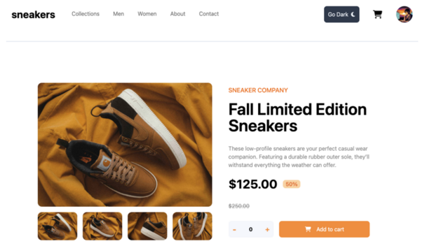
E-commerce Product Page
React, TypeScript, Tailwind, and Storybook
Links & Resources
Description
Functional mockup of a product page developed with React, TypeScript, Tailwind, and Storybook from a Figma design, combining polished aesthetics and advanced features.
This project presents a faithful implementation of an e-commerce product page with particular attention to visual details and user experience.

This project leverages a complete and modern frontend stack, with React and TypeScript for robust and typed development, Vite as a bundler for optimal performance, Tailwind CSS for efficient and consistent styling, and Storybook for component development and documentation.
The product page integrates many essential features for e-commerce:
- Image carousel with intuitive navigation and detail zoom
- Selectors for sizes, colors, and quantities with validation
- Add to cart button with visual feedback
- Customer review system with star rating
The component architecture is particularly well-crafted, following the Atomic Design approach for a scalable structure and the Component-Driven Development (CDD) methodology via Storybook.
Special attention was paid to UX with performance optimizations (React.memo, useMemo), complete accessibility support (WCAG), and subtle microinteractions reinforcing user feedback.
The project followed a modern workflow, from the faithful integration of the Figma mockup to unit testing with Jest and React Testing Library, through comprehensive documentation in Storybook.
This product page demonstrates the importance of careful UX to optimize conversions in e-commerce, while facilitating maintenance through a well-designed modular architecture.
// ProductGallery component with TypeScript and React
import React, { useState } from 'react';
import { motion, AnimatePresence } from 'framer-motion';
import { ChevronLeft, ChevronRight, ZoomIn } from 'lucide-react';
import ImageZoom from './ImageZoom';
import { cn } from '../utils/classnames';

interface ProductImage {
  id: string;
  src: string;
  alt: string;
  color?: string;
}

interface ProductGalleryProps {
  images: ProductImage[];
  selectedColor?: string;
  className?: string;
}

const ProductGallery: React.FC<ProductGalleryProps> = ({
  images,
  selectedColor,
  className
}) => {
  const [currentIndex, setCurrentIndex] = useState(0);
  const [isZoomOpen, setIsZoomOpen] = useState(false);

  // Filter images by color if a color is selected
  const filteredImages = selectedColor
    ? images.filter(img => img.color === selectedColor)
    : images;

  // Reset index if color changes
  React.useEffect(() => {
    setCurrentIndex(0);
  }, [selectedColor]);

  // Image navigation
  const nextImage = () => {
    setCurrentIndex((prev) => (prev + 1) % filteredImages.length);
  };

  const prevImage = () => {
    setCurrentIndex((prev) => (prev - 1 + filteredImages.length) % filteredImages.length);
  };

  // If no image is available
  if (filteredImages.length === 0) {
    return (
      <div className={cn("bg-gray-100 rounded-lg flex items-center justify-center h-96", className)}>
        <p className="text-gray-500">No image available</p>
      </div>
    );
  }

  const currentImage = filteredImages[currentIndex];

  return (
    <div className={cn("relative", className)}>
      {/* Main image */}
      <div className="relative overflow-hidden rounded-lg bg-gray-50">
        <AnimatePresence mode="wait">
          <motion.img
            key={currentImage.id}
            src={currentImage.src}
            alt={currentImage.alt}
            className="w-full h-96 object-contain"
            initial={{ opacity: 0 }}
            animate={{ opacity: 1 }}
            exit={{ opacity: 0 }}
            transition={{ duration: 0.3 }}
          />
        </AnimatePresence>

        {/* Navigation buttons */}
        {filteredImages.length > 1 && (
          <>
            <button
              onClick={prevImage}
              className="absolute left-2 top-1/2 -translate-y-1/2 bg-white/80 p-2 rounded-full shadow-md hover:bg-white"
              aria-label="Previous image"
            >
              <ChevronLeft className="w-5 h-5 text-gray-700" />
            </button>
            <button
              onClick={nextImage}
              className="absolute right-2 top-1/2 -translate-y-1/2 bg-white/80 p-2 rounded-full shadow-md hover:bg-white"
              aria-label="Next image"
            >
              <ChevronRight className="w-5 h-5 text-gray-700" />
            </button>
          </>
        )}

        {/* Zoom button */}
        <button
          onClick={() => setIsZoomOpen(true)}
          className="absolute right-2 bottom-2 bg-white/80 p-2 rounded-full shadow-md hover:bg-white"
          aria-label="Zoom image"
        >
          <ZoomIn className="w-5 h-5 text-gray-700" />
        </button>
      </div>

      {/* Thumbnails */}
      {filteredImages.length > 1 && (
        <div className="flex mt-4 space-x-2 overflow-x-auto">
          {filteredImages.map((image, idx) => (
            <button
              key={image.id}
              onClick={() => setCurrentIndex(idx)}
              className={cn(
                "relative w-20 h-20 border-2 rounded-md overflow-hidden flex-shrink-0",
                idx === currentIndex ? "border-blue-500" : "border-transparent"
              )}
              aria-label={`View image ${idx + 1}`}
              aria-current={idx === currentIndex}
            >
              <img
                src={image.src}
                alt=""
                className="w-full h-full object-cover"
              />
            </button>
          ))}
        </div>
      )}

      {/* Zoom modal */}
      <ImageZoom
        isOpen={isZoomOpen}
        onClose={() => setIsZoomOpen(false)}
        image={currentImage}
        allImages={filteredImages}
        currentIndex={currentIndex}
        setCurrentIndex={setCurrentIndex}
      />
    </div>
  );
};

export default ProductGallery;